


Measure and Boost Scrum Team Performance with Flow Analytics Pro
When a team decides to implement a Scrum framework, to carry out its activities and create value, it is based on a guide (The Scrum Guide) highlighting fundamental values: transparency, inspection, and adaptation. These principles, pillars of continuous improvement, offer Scrum teams a clear framework to collaborate effectively and maximize the value delivered.
However, the Scrum Guide does not describe the actions that the team must implement to achieve its objectives, with the required level of quality. Likewise, when it comes to measuring operational performance or precisely estimating future work, the guide deliberately remains not prescriptive, leaving teams free to define their own approaches.
This lack of clear guidelines for measuring performance can be a major obstacle for certain teams, who struggle to identify the right indicators or visualize inefficiencies in their workflow.
In this article, we will see how the Flow Analytics Pro solution (formerly Flow Analytics Pro), respecting the spirit of the Scrum Guide, allows teams to boost their operational performance, optimize their processes, and stay aligned with the fundamental values of transparency and adaptation.
Empiricism & Continuous Improvement
Empiricism is a fundamental principle of the Scrum framework. It is based on the idea that knowledge comes from experience and decisions made based on concrete observations, rather than assumptions or rigid plans. In Scrum, empiricism is implemented through three pillars:
- Transparency:
- Important aspects of the work process must be visible and understood by everyone. Scrum teams use artifacts like the Sprint Backlog, Increment and Product Backlog to ensure this transparency.
- Inspection:
- Teams regularly inspect their work and progress toward goals to detect gaps, inefficiencies, or problems. This inspection is mainly done through events such as the Sprint Review and the Sprint Retrospective.
- Adaptation:
- Based on the observations made, teams adjust their processes, their backlog or their way of working to improve and stay aligned with the product objectives.
Continuous improvement is one of the operational foundations of Scrum. It is directly linked to the principle of empiricism and manifests itself in the following practices:
- Sprint retrospectives: Teams identify areas for improvement each sprint, whether to resolve problems or strengthen existing practices.
- Progressive incrementation: Each sprint offers an opportunity to improve the quality of deliverables and respond more precisely to the needs of stakeholders.
- Rapid feedback loops: Stakeholders provide feedback on the Increment during the Sprint Review, which helps teams adjust their priorities and processes.
The ultimate goal of Empiricism and Continuous Improvement is to maximize the value produced by the team while reducing inefficiencies.
Flow Metrics at the service of Empiricism and Continuous Improvement
Flow Metrics allow you to measure and analyze the efficiency and fluidity of a team’s workflow. They provide a clear view of processes, identify inefficiencies and support continuous improvement. These metrics give teams actionable data to optimize their processes, increase productivity and maximize delivered value.
Unlike solutions like Actionable Agile (55 Degrees) or Kanban Analytics (Nave), Flow Analytics Pro offers a real operational performance measurement solution, suitable for teams implementing a Scrum framework and not just Kanban Flow Metrics.
We will analyze together what metrics are offered by Flow analytics Pro, for a Scrum team
The Throughput
Flow Analytics Pro allows teams to measure the performance of their flow, through 2 charts:
- The Throughput Run chart
- The Throughput Histogram
The Throughput Run Chart
The Throughput Run Chart is a performance monitoring tool that visualizes throughput over time. Unlike the histogram, which shows a static distribution of flow values over a period, Flow Monitoring allows you to see how flow changes over time, often in real time. This type of chart is particularly useful for monitoring the performance of a system or application over a period of time and spotting significant trends or fluctuations.
- Throughput: Throughput represents the amount of work accomplished by a system over a given period of time. This may include the number of transactions, requests processed, or data transferred per second, minute, hour, etc.
- Evolution over time: Throughput tracking shows how these values change over time, providing a dynamic, temporal view of performance.
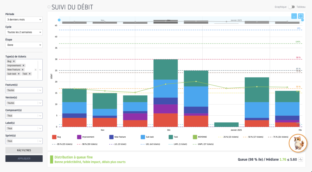
With Flow Analytics Pro, you have the possibility of aligning flow monitoring with the duration of your Scrum Iteration (Sprint), by selecting the monitoring cycle (Daily, Weekly, 2 weeks, 2 weeks, 4 weeks).
The Throughput Run Chart is particularly useful for:
- Track trends in flow: It allows you to visualize gradual or abrupt changes in flow over time, revealing increasing, decreasing trends, or periods of stability.
- Detect anomalies and spikes: By tracking flow rates, it becomes easy to spot anomalies, such as sudden spikes (rapid increase or decrease in flow rate) that could signal unexpected events, performance issues, or changes in system behavior.
- Optimize processes: The run chart can help identify periods when the system is operating optimally or suboptimally, allowing decisions to be made to adjust resources or improve efficiency.
- Measure the impact of changes: If an update or modification is applied to a system, the run chart can be used to monitor the impact of this change on throughput over time.
In the example proposed, over the last 3 months (represents approximately 6 Iterations of 2 weeks), the team can make the following observations:
- An average throughput of 17.63 tickets every 2 weeks, with median and quartile values that show some variability but generally remain stable.
- The values are relatively concentrated between the First Quartile – Represents 25% of tickets (15) and Third Quartile – Represents 75% of tickets (24), indicating generally stable performance.
- A notable peak in throughput is observable during the cycle from November 25 to December 8, 2024, with a total of 30 elements completed. This could reflect concentrated effort on a larger number of tasks and subtasks.
- The cycle from December 23, 2024 to January 5, 2025 experiences low throughput (only 2 elements), probably due to a vacation period or reduced availability of the team.
This graph allows the team to both know the evolution of its performance, but also the distribution of throughput by type of ticket, in order to better prepare the following Iterations and define the allocation percentage associated with each type of ticket: For example, 25% of the Iteration backlog is allocated to the processing of Incidents.
The Throughput Histogram
The Throughput Histogram is a visualization tool commonly used to represent the distribution of flow rates in a given Flow. In simple terms, it shows how throughput values are distributed over a period of time and helps understand the performance or behavior of the system in terms of throughput.
It is very useful for Scrum teams, by highlighting the variability of its flow, over a given period.
Let’s analyze the Throughput Histogram, on the same configuration as the example proposed for the Throughput Run chart.
Here are the findings that the team can achieve:
- The average throughput is around 18 tickets every 2 weeks;
- The median throughput (representing) 50% of throughput cycles is 17 tickets every 2 weeks. The flow distribution shows that the majority of occurrences fall around the median, indicating some consistency in the team’s production.
- The absence of frequencies between throughput 3 and 13 may indicate that the team is generally achieving a minimum level of efficiency, thereby avoiding periods of very low throughput. However, the fact that a flow rate of 2 was possible suggests the need to examine the causes of this insufficiency. In our case, this is due to the end-of-year holiday period.
- The periods corresponding to the highest values (25 and 30) also deserve particular attention to determine whether these levels are sustainable or whether they endanger the sustainability of the team’s work.
Overall, the Throughput Histogram allows the team to highlight a certain stability in their Iteration flow at around 17 tickets every 2 weeks.
Based on the Throughput Run Chart and the Throughput Histogram, the Scrum team will both be able to identify its ideal commitment in terms of throughput per Iteration and allow it to better distribute the percentage to be allocated to each type of ticket (Anomalies, User Story, etc.).
When to use flow monitoring?
The Throughput Run Chart and the Throughput Histogram can be analyzed during the Sprint Planning, as well as during the Refinement (review) phase of the Sprint Backlog, in order to prepare the next Iteration.
The Aging Chart – Analysis of the aging of current tickets
The Ticket Aging Chart in Flow Analytics Pro allows you to track how long tickets have been present in the different current stages of the flow. This chart helps users visualize the age of tickets currently being processed at each stage, to help detect bottlenecks or stuck tickets.
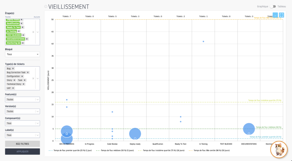
Each point on the graph corresponds to one or more tickets in a given stage, based on the time they spent there.
The Aging Chart is a key tool for:
- Track the age of open tickets: It shows how long each ticket has been blocked or in progress in each stage of the flow. This helps quickly detect tickets that are taking longer than expected and may cause delays.
- Compare to Completed Tickets: The horizontal lines representing past performance of tickets processed (50%, 75%, 85%, 95% of tickets processed) allow you to compare the age of current tickets with the processing times of already completed tickets, to see if current tickets are taking longer than the past average.
- Identify at-risk tickets: Tickets whose stage duration exceeds the lines representing completed ticket performance can be considered at-risk tickets. They may signal bottlenecks or require immediate attention to avoid further delays.
Let’s analyze the example graph:
- DEV IN PROGRESS:
- Ticket ages range from 1 to 17 days with some close to the historical average threshold. A ticket is at age 17, which is above the third quartile (Q3 = 16) and requires vigilance.
- Code Review:
- Ages at 1, 2, 4, 12 days. The 12 day old ticket is above average (9.81) and Q3 (16). It requires attention to avoid a bottleneck.
- Deploy ready:
- Ages at 1, 3 days. These tickets have not reached a critical threshold but we must monitor so that they do not stagnate.
- Ready To Test:
- Ages at 8, 10 days. These tickets do not exceed the critical threshold but are close to average, monitoring recommended.
- DOCUMENTATION:
- Ages at 3.5 days, no thresholds exceeded.
- In Testing:
- A ticket that is 41 days old is well beyond the natural process limit (38) and control limits (48). This is an alert for a major problem in this step.
Detection of risky tickets:
- Tickets aged 17 days (DEV IN PROGRESS): Risk of blocking approaching Q3, requires rapid action.
- 12 day old ticket (Code Review): Increased probability of blocking, well above average.
- Ticket 41 days old (In Testing): This ticket is well above all limits, indicating a systemic problem.
As you can see, the Aging Chart is a powerful tool to help the Scrum team identify its bottlenecks and tickets that pose a risk to achieving the Sprint objective.
When to use the Aging Chart?
The Aging Chart can be used at any time and especially during team synchronization points, such as the Daily Meeting.
The Flow Time Histogram
The Flow Time Histogram represents the distribution of the durations (or flow times) of the tickets processed over an interval, represented by a start step and an end step of the Flow to be analyzed.
The histogram visualizes these times in aggregate to help understand overall processing time performance, and to spot periods where processes took longer than expected.
The Flow Time Histogram is used to:
- Evaluate latency: It shows how processing times are distributed in a system. A histogram with values concentrated around low times suggests that most transactions or events are processed quickly, while a histogram spread out toward high times may indicate latency issues.
- Spot anomalies: By studying the histogram, it is possible to detect inconsistencies, such as unusual spikes in processing time, which could signal periods of overload, configuration errors or resource problems.
- Optimize performance: The Flow Time Histogram helps identify cases where response times are too long and adjust resources or processes to improve the speed of transactions.
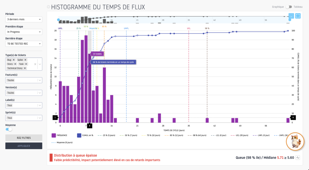
This graph allows the Scrum team to analyze the quality of the distribution of the average time necessary to complete the tickets embedded in an iteration.
Let’s analyze the graph:
- Analysis of flow times shows a distribution concentrated mainly around median and average values. The median is 7 days and the average is 9 days, indicating a general concentration of processing times in this range.
- Quartiles indicate that 50% of tickets are processed between 5 and 10 days. We observe a peak in the distribution around the 7-day processing cycle, with a frequency of 19 tickets, followed by 6 and 8 days with 18 and 15 tickets respectively. This therefore suggests a predominance of short processing times.
- However, there are notable exceptions with processing times that extend well beyond the average, even reaching 62 days in some extreme cases.
In conclusion, we can see a fairly wide distribution of the average ticket processing time, not making the activity of the Scrum team predictable. Only 76% of tickets processed were processed over a period of 10 working days or less, which demonstrates a significant risk that a ticket will not be completed during a Sprint.
But let’s take a closer look at the distribution of time by stage of the Scrum team flow.
When to use the Flow Time Histogram?
The Flow Time Histogram can be used during the Sprint Review and the Sprint Retrospective.
The Flow time Breakdown
Flow Time Breakdown allows you to track the average time tickets spend at each stage of a workflow, as well as compare these times by ticket type.
This chart provides an overview of the performance of each step in the process and allows you to see how processing times vary depending on the types of tickets processed.
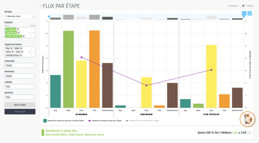
This chart is very useful for:
- Analyze performance by stage: By viewing the average time and median for each stage of the flow, users can see which stages tickets spend the most time in and whether this varies a lot or a little between tickets.
- Identify deviations between the mean and the median: Deviations between the average time and the median can signal the presence of tickets with very long or very short processing times, which can indicate anomalies or inefficiencies in certain steps.
- Compare ticket types: The columns representing different ticket types allow you to see if certain ticket types take longer than others to go through a given step. This allows a detailed and comparative analysis according to the types of tasks or requests processed.
Let’s analyze the graph:
- You can see that the average time to develop a ticket is more than 4 business days. This duration represents approximately 40% of the duration of a 2-week sprint (10 working days) and seems consistent
- The code review phase, on the other hand, seems important, at around 2 working days, or 20% of the duration of the sprint.
- As for the testing phase, it lasts more than 3 working days, on average, or more than 30% of the duration of a sprint.
- Conclusion: An analysis seems necessary, on the state of code review and on the test step, the average duration of which seems too long in relation to the activity. This can come from complexity in the technical environment, specifications requiring numerous round trips, an unstable or complex test environment to implement, etc.
When to use Flow Time Breakdown?
Flow Time Breakdown can be used during the Sprint Review and Sprint Retrospective.
Velocity Chart
Flow Analytics Pro’s Velocity Chart allows you to track the velocity of a Scrum team through successive Sprints, by comparing what was committed at the start of the Sprint (the workload that the team is committed to carrying out) and what was actually accomplished (the work actually completed). This graph helps identify a team’s ability to meet its commitments and better plan future Sprints based on its past velocity.
The Velocity Chart has several key elements:
- The commitment and achievement columns: Each Sprint is represented by two columns. The first column shows the commitment (the amount of work that the team committed to accomplish at the start of the Sprint), while the second column shows the accomplished (the amount of work actually completed at the end of the Sprint).
- The rolling average velocity curve: This curve represents the team’s average velocity over several Sprints, using a rolling average to smooth out variations. It helps identify a stable trend in the team’s ability to accomplish a certain volume of work.
- The Scrum predictability curve: Scrum predictability is a ratio calculated by comparing the commitment and achievement of each Sprint. This ratio allows you to see to what extent the team respects its commitments. The closer this ratio is to 100%, the more the team is capable of completing what it set out to accomplish.
You can select on which fields to calculate the Velocity (Story Point, Number of tickets, Business Value, etc.).

The Velocity Chart is a powerful tool for:
- Track team velocity and capacity: By viewing the Commitment and Completed columns for each Sprint, the team can see how much work has been completed versus what was planned. This provides a better understanding of the team’s actual production capacity over time.
- Analyze Velocity Trends: The rolling average velocity curve smooths out individual fluctuations from one Sprint to the next and shows an overall trend across multiple Sprints. This helps adjust expectations for future Sprints based on the team’s actual capabilities.
- Assess the team’s predictability: Scrum predictability is a key indicator for measuring the team’s ability to meet its commitments. If the ratio is close to 100%, it means that the team is very reliable in its forecasts and in accomplishing its work. If the ratio is too low, it indicates that the team often overestimates its ability to complete the work.
Let’s analyze the graph:
- We can see a certain stability in the measured velocity, in number of tickets, over all the sprints, with the exception of sprint 39, corresponding to a summer vacation period, with a reduced team.
- The observation is that this team has stable performance, with a predictability rate (ratio between commitment and achievement) greater than 80%.
When to use the Velocity chart?
The Velocity Chart can be used during the Sprint Review, the Sprint Retrospective and the Sprint Planning.
The Sprint Dashboard
The dashboard by Sprint (Iteration) allows you to analyze the Flow Metrics on a specific Sprint of a Project or a Jira Board.
Flow Metrics are only calculated on tickets associated with the selected Sprint.
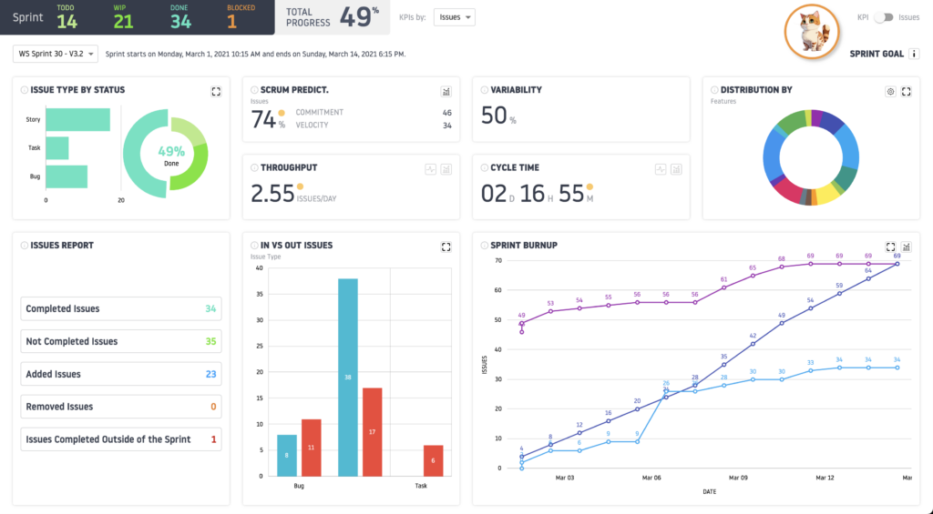
This dashboard provides major information on the performance of a sprint:
- The distribution of ticket types by status;
- The average flow rate/day over the sprint;
- The average Cycle Time of tickets processed during the sprint. This indicator provides important information on the consistency between the duration of a sprint and the average time required to process tickets;
- The distribution of tickets by Version (Release), Feature, Label, components, Priority;
- The variability of the sprint Backlog, i.e. its evolution since the launch of the sprint;
- The consistency monitoring graph between the types of tickets included in the sprint and those completed at the end of the sprint.
Let’s analyze our graph:
- The Burnup Chart shows that the team delivered 34 tickets out of the 46 initially planned, with a predictability of 74%. Although the pace has made it possible to achieve almost three quarters of the objectives set, a gap remains to be closed to achieve all of the sprint objectives. An adjustment of initial commitments or an improvement in the management of contingencies could reduce this risk of deviation.
- The tickets within the backlog are mainly “Stories” (38 committed), highlighting a focus on features rather than bugs. This can be positive for the development of new features but could also mean a lack of attention to bugs which, even if they represent only 8 commits, have a high completion rate (11 bugs completed). A reassessment of priority could optimize this balance.
- The backlog showed significant variability with 50% of its composition added during the sprint (23 tickets). This may indicate an initially undervalued backlog or fluctuating prioritization. A more rigorous and regular refinement process can help stabilize and make backlog content predictable.
- Strengths:
- Strong ability to complete tickets, particularly bugs with 11/8 initially planned, which demonstrates good performance in handling technical debt.
- A reasonable average cycle time, allowing relatively smooth flow management.
- Weaknesses:
- Predictability at 74%, which shows a need to improve anticipation of possible commitments.
- Significant backlog variability that can complicate work prioritization and scheduling.
When to use the Sprint Dashboard?
The Sprint Dashboard can be used during the Sprint Review, the Sprint Retrospective and the Sprint Planning.
Alice your augmented Scrum Master

The integration of Alice, the artificial intelligence of Flow Analytics Pro, brings a new dimension to the use of Sprint Flow Metrics and Dashboards. By combining automation, advanced analysis and recommendations based on concrete data, Alice becomes a true digital teammate serving Scrum teams.

With the integration of Alice, the analysis of Flow Metrics and the use of Sprint Dashboards are no longer limited to static visualizations. Alice transforms these tools into levers for proactive action, continuous improvement, and strategic decision-making. By making data understandable, actionable and personalized, Alice allows Scrum teams to reach a new level of performance and alignment with their objectives. A revolution for agile teams seeking to maximize their efficiency and impact.
With Flow Analytics Pro, you also have the ability to retrieve Alice’s analyzes in PDF format or copy them to integrate them into your presentations.
Conclusion
In the context of a Scrum environment where continuous improvement is essential, Flow Analytics Pro is positioned as an essential tool for transforming data into performance leverage. By relying on Flow Metrics, it allows Scrum teams to better understand their processes, identify obstacles in their workflow, and optimize their way of working, while remaining aligned with the fundamental values of the Scrum Guide: transparency, inspection, and adaptation.
Thanks to the integration of Alice, its artificial intelligence, Flow Analytics Pro goes even further by providing predictive analyses, personalized recommendations, and dashboards adapted to the context of each team. This intelligent support provides unparalleled clarity and facilitates decision-making for teams, while strengthening their ability to deliver value consistently and predictably.
Flow Analytics Pro is not just an analysis tool, it is a tool to support operational excellence. Scrum teams who adopt it now have a powerful tool allowing them to measure their performance and implement their continuous improvement loop.